Customer relationship management (CRM) technology plays a central role in critical business functions like managing sales workflows, powering marketing campaigns, tracking customer interactions, and more. As a result, the CRM database houses an incredible amount of information related to your business and its customers.
Your CRM can also serve as a powerful analytical tool to help you identify what’s working—and what’s not—across the entire customer lifecycle. But leveraging the data in your CRM to uncover meaningful insights can be tricky. That’s where CRM dashboards come in.
Dashboards are among the most important tools in a robust CRM platform. In this article, we’ll take a deep dive into CRM dashboards and how they can benefit your business.
What is a CRM dashboard?
CRM dashboards provide a real-time snapshot of your sales activity, performance metrics, progress toward goals, and other KPIs in one central location. Using visual elements like charts, graphs, tables, and gauges, a CRM dashboard can turn your customer data into a reliable, accessible resource for smart decision-making.
Need to know who your top sellers are? Looking for a comparison of actual versus projected revenue? Want to create visualizations of average deal size, win rate, or opportunity status? Need performance results from the latest marketing campaign? CRM dashboards can put all this information at your fingertips for instant analysis and deep, granular insights.
CRM dashboards vs CRM reports
While both tools help you analyze customer relationship management data, they serve different purposes in your sales workflow.
CRM reports are static snapshots of your sales data at a specific point in time. Think of them like printed photographs—useful for analysis, but they don’t change once created.
CRM dashboards provide real-time, interactive views of your customer relationship management data. While reports show you what happened, dashboards show you what’s happening right now. Sales teams can track their sales pipeline, monitor sales performance, and spot trends as they develop. Plus, dashboards let you drill down into specific metrics without generating new reports every time you need answers.
Why are CRM dashboards so crucial?
The clear benefit of a CRM dashboard is that it gives you the power to slice and dice your data in almost any way you can imagine. CRM dashboard functionality lets you examine performance from different angles and drill into the metrics that matter most. But there are also plenty of less-obvious reasons for using a CRM dashboard:
Real-time updates on every deal and KPI
Unlike CRM reports, which are static documents, a CRM dashboard updates in real time based on changes in your data—so you always know the information is current.
This means your sales team can spot problems the moment they happen. Deal stuck in negotiations for too long? You’ll see it immediately. Sales rep behind on their monthly activities? The dashboard flags it before it becomes a bigger issue. No more waiting for weekly reports to discover what went wrong last Tuesday.
Better team alignment across all departments
A CRM dashboard gives every team member access to the insights they need to stay on track—without clicking around in the CRM software or wading through tons of data.
When marketing, sales, and customer service all see the same customer information and pipeline metrics, handoffs get smoother. Marketing knows which campaigns actually generate revenue, not just leads. Sales understands which prospects are most likely to convert. And customer service can spot at-risk accounts before they churn.
Consistent strategic guidance for business growth
At any given moment, CRM dashboards provide a clear picture of where things stand—and where the sales team should focus their attention—which can lead to better overall sales performance.
Think of it like GPS for your revenue goals. Instead of guessing which deals to prioritize or which marketing efforts are paying off, you get turn-by-turn directions based on real sales data. Your team spends time on activities that actually move the needle, rather than busy work that feels productive but doesn’t drive results.
18 sales KPIs to track with your CRM dashboards
Not all metrics are created equal. The best CRM dashboards focus on KPIs that actually help move the needle and influence decisions—not vanity numbers that look impressive but don’t change how your team operates. These KPIs offer clear visibility into pipeline health, sales effectiveness, and customer retention, helping teams monitor progress and spot risks before they become problems.
Sales pipeline health metrics
Your pipeline tells the story of future revenue. These metrics reveal where deals get stuck and help you forecast more accurately.
- Pipeline value by stage shows how much revenue sits at each point in your sales process. When you see deals piling up in one stage, that’s your cue to dig deeper.
- Average deal age tracks how long opportunities spend in your pipeline. Deals that sit too long often signal pricing issues or unclear next steps.
- Pipeline velocity measures how fast deals move from first contact to closed-won. Faster velocity usually means better qualification and smoother handoffs between teams.
- Stage conversion rates reveal which parts of your sales process work best. Low conversion between specific stages points to training gaps or process bottlenecks.
- Pipeline coverage ratio compares your pipeline value to quota targets. Most teams need 3-4x coverage to hit their numbers consistently.
Win rate and conversion metrics
These numbers show how efficiently your sales team turns prospects into customers—and where you’re losing deals you should be winning.
- Overall win rate divides closed-won deals by total closed deals. Industry benchmarks vary, but tracking trends over time reveals whether your sales process is improving.
- Conversion rate by lead source tells you which marketing channels generate the best prospects. Not all leads are equal, and this metric proves it.
- Win rate by sales rep highlights your top performers and identifies who needs coaching. Big gaps between reps often point to training opportunities or process inconsistencies.
- Competitive win rate tracks deals where you faced specific competitors. This helps refine your positioning and identify competitive weaknesses.
Activity tracking metrics
Want to know if your team is actually working the pipeline? These metrics connect daily activities to real results.
- Calls and emails per opportunity shows how much effort it takes to move deals forward. Too many touches might mean poor lead quality; too few suggests missed follow-up opportunities.
- Meeting-to-opportunity conversion rate measures how well your team turns conversations into qualified deals. Low conversion rates often signal targeting or messaging problems.
- Activity volume per sales rep tracks individual productivity without micromanaging. Consistent activity patterns usually predict consistent results.
- Response time to new leads affects conversion rates more than most teams realize. Speed wins—especially in competitive markets.
Forecast accuracy metrics
Nothing kills credibility faster than missing your forecast. These KPIs help you predict revenue more reliably.
- Forecast vs actual revenue compares what your team predicted to what actually closed. Big misses reveal gaps in your qualification process or deal visibility.
- Quota attainment by rep shows who’s hitting their numbers and who needs support. Patterns across multiple quarters help with territory planning and goal setting.
- Deal slippage rate tracks how often deals push to later quarters. High slippage usually means optimistic forecasting or unclear buying timelines.
- Commit vs best case accuracy measures how well your team differentiates between likely deals and stretch goals. This builds trust with leadership over time.
Customer retention and satisfaction metrics
Keeping existing customers happy costs way less than finding new ones. These metrics help you spot problems before customers walk away.
- Customer churn rate measures how many customers you lose each quarter. Rising churn often signals product issues, poor onboarding, or inadequate support.
- Net promoter score (NPS) tracks customer satisfaction and likelihood to refer others. Promoters become your best marketing channel; detractors highlight areas for improvement.
- Customer lifetime value (CLV) shows the total revenue you can expect from each customer relationship. Higher CLV usually justifies higher acquisition costs and better retention investments.
- Expansion revenue rate tracks how much additional business you generate from existing customers. This metric often matters more than new customer acquisition for long-term growth.
Which CRM dashboard features are must-haves?
The best CRM dashboards share a few common traits—they’re easy to set up, adapt to your team’s workflow, and actually get used. These features separate the platforms that help your business grow from the ones that just look impressive in demos.
Customizable visualizations
Your sales process is unique. Your dashboard should be too.
Look for dashboards that offer flexible layouts, filters, and chart options (ahem, like Insightly). This makes it easy to tailor insights for different teams and goals. Customization helps focus attention on what matters most.
Pipeline data might work best as a funnel chart, while win rates shine in speedometer-style gauges. Revenue trends? Line graphs tell that story perfectly. The key is having options—not being stuck with whatever your CRM is forcing your to use.
Time period controls matter more than most people realize. You’ll want to zoom in on this week’s activity when deals feel stagnant, then zoom out to quarterly patterns when planning territory changes. Good dashboards let you switch between views without rebuilding everything from scratch.
Role-based permissions and views
Choose dashboards that provide role-specific access and views. This ensures reps, managers, and leaders see data relevant to them, improving focus and protecting sensitive information.
Sales reps need their personal pipeline front and center—quota progress, upcoming tasks, and deals that need attention. They don’t need to see company-wide forecasts that might distract from their own numbers.
Managers want team performance comparisons and coaching opportunities:
- Which reps are crushing it?
- Who’s struggling with follow-up?
- Where should we focus training efforts?
Executive dashboards focus on strategic trends and high-level metrics—not daily activity details that executives shouldn’t micromanage anyway.
Here’s the thing:
When everyone sees the right data for their role, adoption goes through the roof. Nobody wants to dig through irrelevant metrics to find what they actually need.
Integration with external tools
Dashboards that integrate with tools like email, finance, or project systems give a fuller view of customer activity and impact. This boosts cross-team collaboration and decision-making.
Email platform connections show which outreach campaigns actually drive pipeline movement. You’ll see if that fancy email sequence converts prospects or just annoys them. Calendar integration reveals how meeting volume affects deal velocity—more face time usually means faster closes, but the data proves it.
Financial software links connect revenue forecasts to actual cash flow. Insightly’s AppConnect makes these connections simple without needing developers or complex APIs.
Marketing automation feeds help you track leads from first touch to closed deal. When marketing and sales see the same attribution data, arguments about lead quality disappear. Everyone’s looking at the same scoreboard.
7 roles that rely on CRM dashboards (and how each can use them)
CRM dashboards are incredibly useful for planning and decision-making across a variety of functional teams. Roles that can benefit from using a CRM dashboard include:
- Sales reps. CRM dashboards can help salespeople track their pipeline and progress toward individual goals, as well as managing tasks and prioritizing deals appropriately.
- Sales leaders. With the right dashboards, sales managers can see how the team is functioning as a whole and assess the health of the sales pipeline. They can also evaluate individual sales rep performance and identify opportunities for coaching and feedback.
- Marketing teams. Marketers can set up CRM dashboards to track campaign performance and measure the quality of marketing-generated leads.
- Account managers. Teams that are focused on building and maintaining client relationships can leverage dashboard insights to prioritize projects and uncover trends.
- Customer service and support teams. CRM dashboards allow customer-facing teams to examine key metrics like average response time and satisfaction scores. These insights are useful for increasing efficiency, improving customer experience, and reducing churn.
- Data analysts. The CRM dashboard is an excellent source of business intelligence data for analysts looking to identify trends and guide their organization to better decisions.
- Business leaders. C-level executives can use CRM dashboards to assess overall business health and monitor progress toward key business goals.
Are custom dashboards better than standard dashboards?
Because every business is unique, most modern CRM software platforms give you the option to customize your CRM dashboards. Customization provides an added level of flexibility to highlight the data that’s most important to you, organize it how you want, create granular data visualizations, and drill into exactly what you need to see.
Why custom dashboards are worth building in your CRM
While pre-built CRM dashboards deliver common insights every business needs, there are some compelling reasons to customize your dashboards. These include:
- More flexible analysis: Custom dashboard widgets allow you to display data over any given time frame, for a more granular view of sales activity, pipeline status, sales forecasts, and progress toward goals. For example, you could customize your dashboard to show lead source over the last 30 days, opportunity value in the current quarter, or year-to-date deal volume.
- Better data filtering: Tweaking the data that’s displayed in your CRM dashboard can dramatically increase its usefulness. For instance, you might filter your sales data to show closed deal volume by team, individual, or region. You could compare actual sales numbers against revenue goals to analyze performance by team, individual, or region.
- Easier viewing of high-priority data: Customization lets you tailor the layout of your CRM dashboard as well as the types of data being displayed. You can rearrange the order of dashboard widgets or resize various elements so it’s easy to see the data that’s most important.
- Versatile data visualization: In a custom dashboard, CRM data can be displayed in a variety of visual designs—including bar graphs, line graphs, pie charts, tables, and speedometer-style gauge charts. So you’re free to choose the graphic style that best aligns with the data you’re analyzing. For example, a gauge chart is a great choice for displaying progress toward a quarterly sales goal, while year-over-year revenue comparisons are easy to digest in a bar graph.
Key factors to consider when customizing your dashboards
As you design your custom CRM dashboard, it’s important to make sure it will meet your needs and the needs of your extended team. Consider the following when creating and customizing your CRM dashboard:
- Sales process and customer lifecycle. Your CRM dashboard should encompass the most important business activities throughout the sales cycle, including post-sale communication and support.
- Important KPIs. Selling is a complicated process with plenty of metrics—but that doesn’t mean they should all show up in your CRM dashboard. Focus on the KPIs that are most critical to your team’s success, so your dashboard provides a meaningful overview of business performance.
- Appearance. CRM dashboards contain a lot of information, so it’s best to keep the layout simple. Maximize white space whenever possible and stick to a limited color palette that aligns with your corporate brand.
- Ease of use. Your CRM dashboard should provide an easily digestible snapshot of the metrics that matter most. Make sure the widgets you select are organized to tell a clear and compelling story—without unnecessary clutter.
Remember—while it’s easy to modify a CRM dashboard, constant tinkering will only cause confusion—and eat up precious time. Instead of making tweaks on the fly, invest the time up front to create a dashboard that aligns with your business needs, then set a schedule for testing and modification so you can optimize your dashboard on a regular basis. Gathering feedback from team members will help to ensure your CRM dashboard is working as effectively as possible.
Bring your CRM data to life with Insightly CRM dashboards
Every paid Insightly CRM plan comes equipped with dashboard functionality to help you visualize key metrics, share information across your organization, and make smart, data-powered decisions. Plans at the Plus level include a set of standard dashboards, while Professional and Enterprise accounts also give you the ability to create your own custom dashboards.
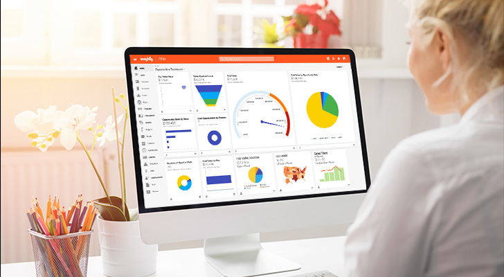
Insightly standard dashboards
Three standard dashboards are included with every paid Insightly CRM plan. Each of these pre-built dashboards contains a set number of widgets—or Dashboard Cards—that allow you to visualize your CRM data through charts and graphs. Standard dashboards can’t be modified, but they include the most common—and most useful—data points for any organization.
- Opportunities Dashboard is the largest of the standard dashboards with 10 cards to help you track sales performance, including Total Sales, Sales Pipeline Funnel, Top Sales Reps, Win Rate, and more.
- Projects Dashboard includes four cards to analyze projects as they move through the sales funnel: Project Pipeline Funnel, Projects by Status, Projects by Rep and Status, and Projects Completed by Month.
- Leads Dashboard also has four cards for monitoring lead gen activity: Leads by Status, Leads by Source, Leads by Month, and Top Reps by Lead.
Insightly custom dashboards
In addition to the three standard dashboards, higher-level Insightly CRM plans allow you to create and modify your own custom dashboards. Professional plans allow up to 100 cards on each dashboard, while Enterprise customers can add an unlimited number of cards to their dashboards.
Creating a new dashboard is a simple drag-and-drop process. Just follow the step-by-step instructions for building your dashboard, then populate it with Dashboard Cards to visualize your most important data. You can also add, delete, resize, or rearrange your cards at any time.
Following are some common data points and metrics you might want to incorporate into your custom CRM dashboard:
- Sales team activities
- Sales pipeline data
- Sales performance/quota progress
- New leads
- Closed deals
- Conversion rate
- Sales cycle length
- Customer retention/churn
- Customer satisfaction/NPS
Ready to get started?
Insightly is the only CRM solution that offers robust customization on a shared data platform to deliver a single, unified view of every customer. Our simple, scalable platform aligns cross-functional teams for better decision-making and a seamless end-to-end customer experience.
Get started with a free trial of Insightly CRM today, or request a personalized demo to see how our solution can help your company achieve its business goals.
Common follow-up questions about CRM dashboards
After setting up your dashboards, you’ll probably run into some practical questions about making them work in the real world. Here are the most common ones we hear.
How long does it take to see results from new dashboards?
Dashboard adoption typically happens within 2-3 weeks when built correctly. You’ll know they’re working when team members start checking them daily and asking for specific metrics to be added.
What happens if my dashboard data looks wrong?
Inaccurate dashboard data usually stems from incomplete CRM records or inconsistent data entry. Check your required fields, standardize dropdown options, and train your team on proper data hygiene practices.
Can I connect my dashboard to other business tools?
Most modern CRMs integrate dashboards with external applications through native connections or APIs. Insightly’s AppConnect lets you pull data from tools like QuickBooks, Mailchimp, and project management platforms into unified dashboard views.
How do I know which dashboard metrics actually matter?
Meaningful dashboard metrics directly connect to revenue goals and daily team activities. Focus on metrics that help you make decisions—like pipeline health, deal velocity, and quota progress—rather than vanity numbers that look impressive but don’t drive action.
What’s the biggest mistake teams make with dashboard customization?
Over-customization kills dashboard effectiveness faster than anything else. Teams often add too many widgets, creating information overload that nobody wants to use. Start simple, then add complexity gradually based on actual user requests.
How do I get my team to actually check dashboards daily?
Daily dashboard usage happens when the data directly impacts individual performance and commissions. Make dashboards mobile-friendly, load quickly, and show information that helps reps prioritize their day—like upcoming tasks and hot prospects.